
Powering Travel
Podcast
The Powering Travel podcast serves as a cornerstone in solidifying Expedia Group's position as a trusted traveler technology platform. Through this engaging and approachable medium, the aim is to underscore and showcase Expedia Group's expertise and role as a "travel ecosystem connector." The podcast brings leaders together from various corners of the travel industry, providing perspective and insightful discussions on the dynamic intersection of technology and travel.
This project was a significant cross-team collaboration involving the industry relations team, the creative team, and the digital experience team. It marked one of the earliest projects I undertook upon joining the team, and I have been consistently involved in its development across each season. From its inception to subsequent iterations and brand refreshes, I have played a key role in shaping and evolving the project over time.
Role: Branding, Concepting, Visual Design
Industry Relations/ Program Lead: Sam Lopez
Design Director: Eve Lee
Partner Web SME/ Design Support: Melanie Pavao
Copywriter: Susannah Hutchenson
Copy Lead: Leigh Camp
Content Strategist: Kerry Brunelle
Project Manager: Rachael Decker, Becca Russell
Photography: Expedia Group Brand Photo team
Web & Digital Experience: David Lee, Brooke Ribelin
Podcast production agency (audiogram): Quill
Deliverables: Podcast cover art, Social (audiogram) posts, Episode heroes, Podcast landing page and Episode child pages
Early stages
The progression and refresh of the brand were evident throughout each season, with Season One representing the legacy brand, Season Two serving as an interim or transitional phase, and Season Three reflecting the post-rebrand identity. One of the most significant challenges we faced was strategically reshaping the brand from its original form while the company was in the process of rebranding.
During Season Two, when the brand identity was still being developed and finalized, we opted to simplify certain elements that we could confidently address. This involved streamlining the color palette, notably eliminating the teal entirely, and simplifying the illustrative elements to align with the evolving brand direction.
The primary creative deliverables for each season included the following:
-
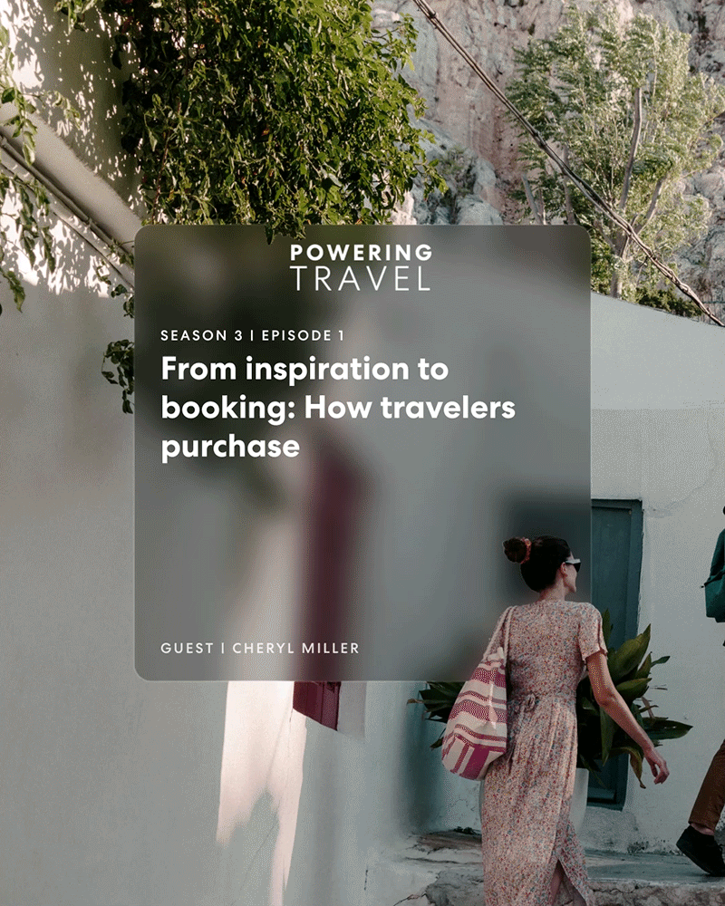
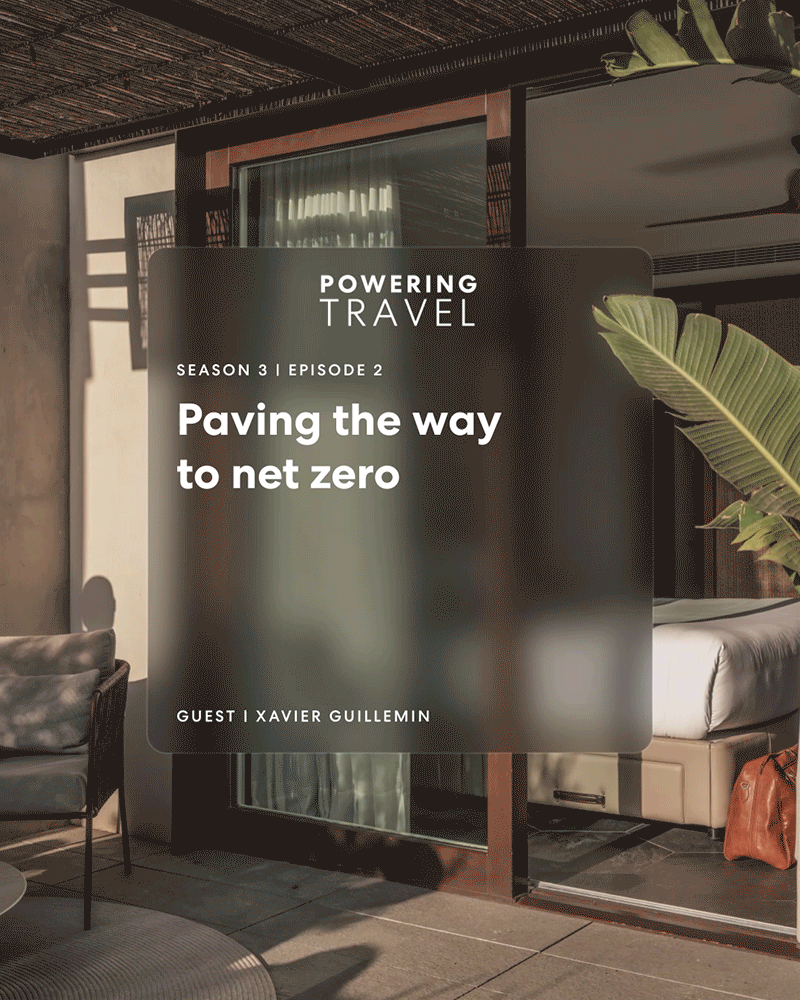
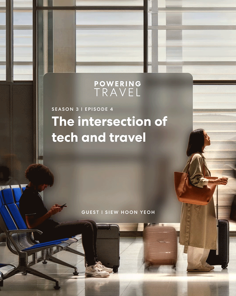
Podcast cover art: This served as the visual representation and face of the podcast, amplified on podcast platforms such as Spotify and Apple podcast.
-
Episode heroes: These were graphics or images designed for social media posts on Expedia Group social channels and web pages to highlight individual episodes. They played a crucial role in promoting episodes and generating interest among the audience.
-
Landing page/child page mock-ups: These mock-ups were created for the partner website to showcase the podcast and its episodes. Collaborating with developers from the digital experience team ensured that the design concepts could be effectively implemented on the website.
SEASON ONE (LEGACY BRAND)
SEASON TWO (INTERIM)


Final approach
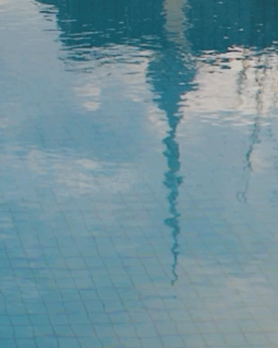
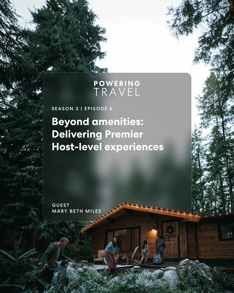
To further develop these concepts, we decided each season are assigned a specific color and imagery to represent its overarching theme, which gave distinction between each season especially when scrolling through episodes on Spotify. I curated images based on the primary colors of our House of Brands- yellow, red, and blue (Expedia, Hotels.com and Vrbo) as starting points. For Season One, which focuses on hospitality and partner-centric themes, I selected an image representing a hotel restaurant or service. Season Two, centered around travelers and destinations, featured an image of the fabric of a hot air balloon as a travel activity. Finally, Season Three, emphasizing product, service, and technology in travel, was assigned blue – a color associated with technology. However, rather than opting for a generic tech-related image, I chose one that maintained a travel-related essence. The reflection of the sky and hotel building in the water evoked a sense of endless possibilities and a forward-thinking direction in travel.
SEASON 1:
Hospitality, partner-focused

SEASON 2:
Destinations, traveler-focused

SEASON 3:
Tech in travel, overall

Additionally, I explored various logo lock-up animations that visually illustrated the meaning of the words. For example, "powering" could be bolded and "travel" extended or flipped down like a departure board at an airport. While these animations added an engaging element, we ultimately decided on a more simplistic lock animation to ensure it didn't distract from the content, although it was enjoyable to mock up these motion samples.
LOGO LOCK UP ANIMATION


Touchpoints
Similar to previous seasons, there are multiple marketing touchpoints aimed at driving audiences to the podcast platforms and the Expedia Group Partner Site. One such touchpoint is the episode audiogram, which features an audio snippet/preview of the episode along with the episode hero. The approach to creating these audiograms was aligned with the photography-first approach used for the cover arts. A challenge we faced was designing a layout that effectively accommodated both imagery and essential information, such as the podcast lock-up, episode title, guest speaker, and caption. Rather than relying on a scrim to overlay text, I utilized a background blur, which ensures readability as well as aligns with the Expedia Group Branding update. This treatment also allows the photography to shine through, and to enhance it further, I would crop details of the images and layer them on top of the text block to add dimension.
To incorporate motion and captions into the audiograms, I collaborated with a motion designer at Quill, a podcast production agency. This involved integrating the caption and motion into the audio/frequency wavelength, serving as a visual cue to indicate that it's a clip as viewers scroll through their feed. On their end, the agency helped us update and redistribute the refreshed cover arts across all of the platforms.
Each episode will have an audiogram shared on our social channels to amplify the new launch, directing listeners to the official Powering Travel landing page and episode child pages. These pages provide additional context on the topic, guest bios, and transcripts. The web portion involved close collaboration with content and copywriters to create mock-ups aligned with the brand tone and standards. After mock-ups were reviewed with the Design Lead/Web Subject Matter Expert (SME) and Copy Lead, they were shared with developers from the Digital Experience team for page building. I worked closely with the developers to ensure quality assurance (QA) before launch.
SEASON 3 TRAILER
EPISODE AUDIOGRAMS


SPOTIFY
PARTNER SITE LANDING PAGE


The challenge
After successfully completing Season Two and with Season Three underway, we saw an opportunity to completely overhaul the branding ahead of the new season. Collaborating closely with the creative director, we embarked on a brainstorming process to explore various ideas. Initially, our approach was to evolve from the original branding, retaining elements such as the line art motifs and the capsule or pill shape introduced as a graphic device during the main brand refresh. We also aimed to utilize a simple color palette (primary, accent, and neutral blues).
While incorporating the capsule shape was symbolic, representing both a podcast microphone and an airplane window, we encountered challenges with readability when combining text, line art, and color within the limited thumbnail space for cover art on platforms like Spotify and our landing page. Also, we wanted to transition the mood from being "too illustrative". Recognizing these constraints, we ultimately concluded that it would be challenging to continue building upon the original brand elements for Season Three. Thus, we made the decision to start fresh and develop a new branding direction from scratch.
PHASE 01:EARLY CONCEPTS

Discovery & ideation
We sought inspiration from real-world examples, drawing insights from a music podcast program called Dissect and a contemporary art magazine named Frieze. Both brands exhibited a consistent logo lock-up across every episode or edition, while the cover art effectively illustrated themes or topics through illustrations, patterns, or photography. Inspired by this approach, we opted to fully leverage our brand photography, a new addition to Expedia Group's rebranding efforts. Our photography also served as a key component of our color palette, allowing the images to speak for themselves.
In the second phase of the project, we curated a diverse selection of angles and perspectives related to travel experiences. The composition primarily focused on cropped-in images, capturing intimate moments or dynamic, in-the-moment shots with blurred backgrounds or bokeh effects. . The goal was to capture visceral moments of travel rather than relying on generic depictions such as airplanes or suitcases. These images were envisioned as fragments of a larger visual narrative; at first glance, they might appear abstract, but upon closer inspection, they would reveal themselves as part of a cohesive whole.
For the logo lock-up, we opted for a wordmark approach, with "Powering Travel" using our current Expedia Group branded font to maintain consistency and minimalism. We explored various weights, sizes, and tracking to ensure that "Powering" (in bold) and "Travel" were balanced, with neither overshadowing the other.
PHASE 02: NEW APPROACH
