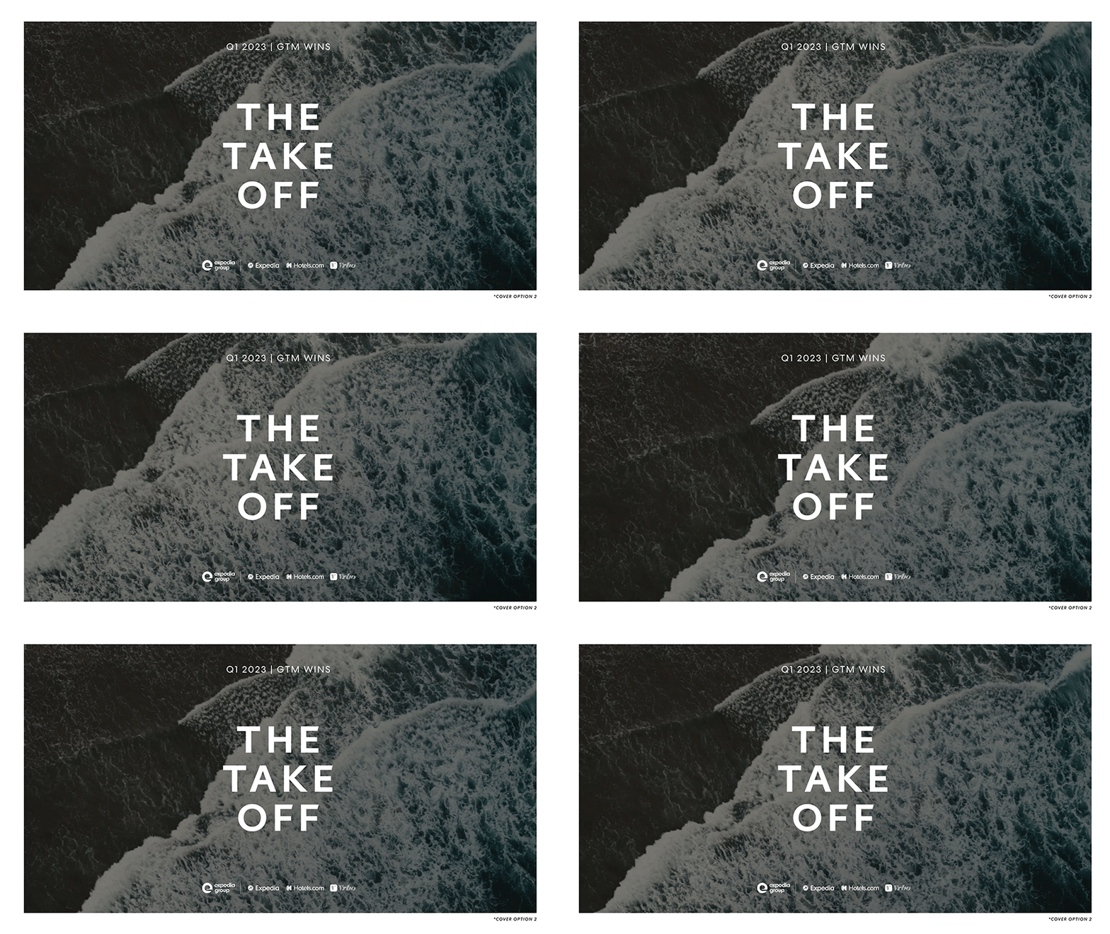
The Take Off
Newsletter
The Take Off is a quarterly internal cross-functional newsletter crafted by the B2B Marketing team. It serves as a platform to spotlight partner-centric marketing and communication strategies that propel our business forward. Essentially, it offers a concise overview of key GTM wins, business impacts, and reports aligned with our strategic pillars:
-
Acquire and Activate
-
Existing Partner Growth
-
Commercial Excellence
-
Drive Traffic
-
Strengthen B2B Brand
Each GTM team contributes a win submission for the quarter, which is then compiled into the newsletter along with relevant graphics or resources. This curated snapshot provides stakeholders with insights into our achievements and reinforces our commitment to partner success.
Role: Concepting, Visual Design
Design Director: Eve Lee
Design Support: Melanie Pavao
Photography: Expedia Group Brand Photo team
Project Manager: Rachael Decker
Industry relations/ PR team: Bridget Benelisha, Caitlyn Crisp
Deliverables: Quarterly newsletter
Strategy & output
During this period, Expedia Group underwent a branding refresh, presenting certain challenges in maintaining consistent creative direction in the interim. Brand elements such as illustrations, icons, and colors were still under development and undergoing rigorous testing, leaving room for adjustments. However, the creative teams and leadership teams have collectively agreed to adopt a more reductive approach in design, emphasizing minimalism and prioritizing functionality over unnecessary embellishments.
Given that the majority of the pages will feature win submissions and accompanying graphics, I aimed to ensure simplicity in design, particularly with regards to color usage. I opted for a palette of white or neutral greys to provide a clean backdrop for graphics, reserving our core blue sparingly for emphasis and utilizing accent blue for links or CTAs. Areas where we could incorporate more brand expression, such as the cover, table of contents, and commentary introduction from our VP, were optimized to showcase our in-house brand photography effectively. As a nod to newsletter's title, "The Take Off," I made a deliberate choice to select photos that evoke a sense of motion, such as a person diving into water, someone on a train, or individuals running. I also decided to incorporate subtle animations to enhance these images and bring them to life.
Outcome
With the transition to InDesign Publisher, the process of consuming and navigating through the content became seamless. The designed navigation bar and page anchors provided viewers with the flexibility to review specific areas easily, while the embedded clips and animations played smoothly, significantly enhancing the overall experience. Anecdotally, the new format was well received, surprising the team with excitement to see their wins displayed in an editorial approach.
Analytically, since the launch of this new edition in Q1, we observed a growing level of engagement. Many teams participated and submitted more wins in Q2, likely due to the soft launch and positive reception. The number of views increased steadily between Q1 and Q2, continuing to rise throughout the year.


Discovery
The retrospective of the pilot newsletter launched the previous year yielded positive feedback overall, particularly in its effectiveness in showcasing GTM work despite being the inaugural edition. However, there were several areas identified for improvement in the upcoming edition. These included editorializing the content to enhance its depth and moving away from a format reminiscent of a landing page or infographic one-sheet. User experience enhancements were also prioritized, such as enabling resource sharing and linking, the ability to track metrics, and facilitating newsletter sharing via email or internal team sites.
With these criteria in mind, I collaborated with the Senior Designer and Creative Director to explore potential platforms for hosting the newsletter, weighing their respective advantages and disadvantages. Ultimately, we determined that Adobe InDesign Publish online offered the most suitable solution, primarily due to its design flexibility and robust analytics capabilities. This platform allows us to track metrics such as page views, total readership, average read time, total read time, and views by device. Additionally, its design capabilities enable the creation of a navigational menu for content organization, support for interactive elements such as motion, links, buttons, and video integration.
My initial task was to create low-fidelity wireframes and prototypes to visualize the template and newsletter hierarchy. This approach ensured efficient content flow once the teams completed their submissions, allowing us to meet the fast-approaching newsletter release date.
PILOT

PROTOTYPE


